
Oppia Lesson Checkpoints
Help students track their learning progress
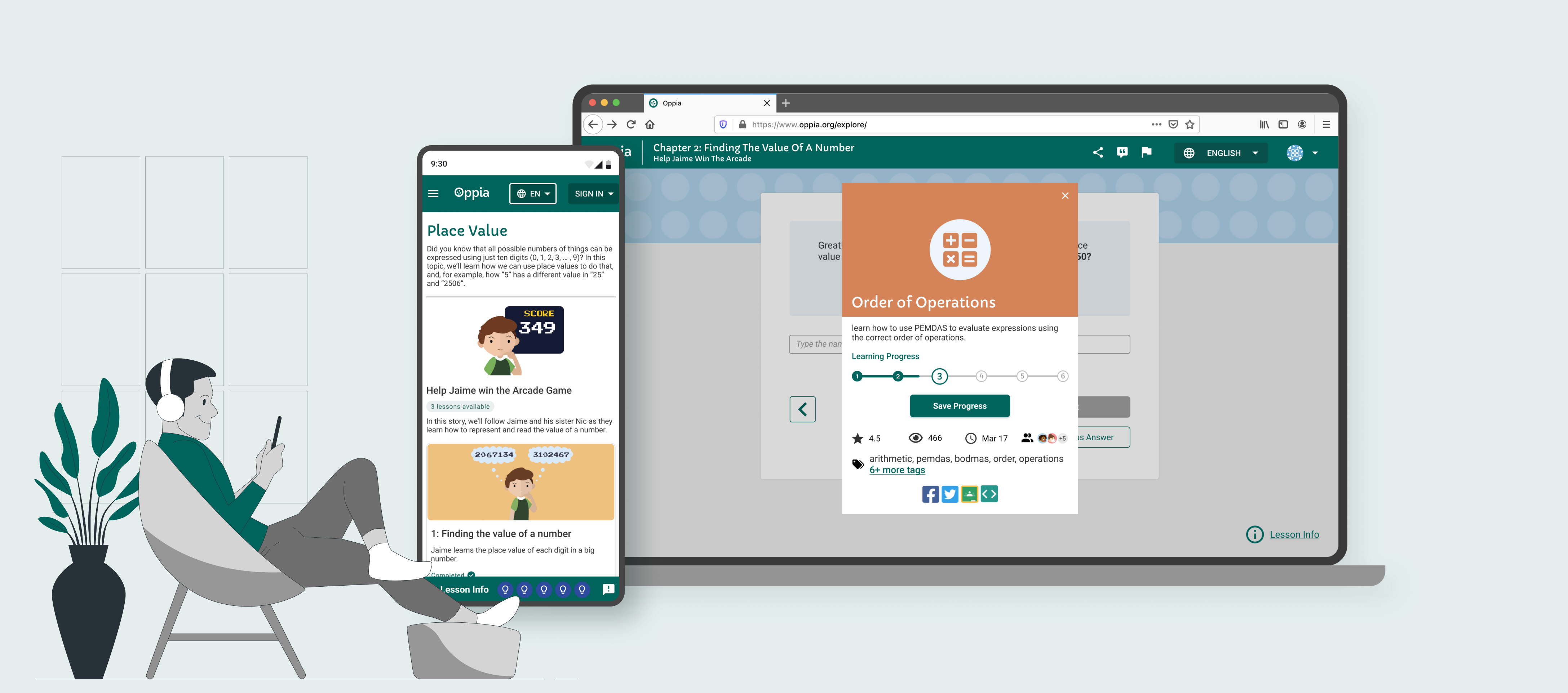
Designed a learning system for featuring progress checkpoints to boost student motivation. The platform ensures a seamless educational experience by automatically saving and restoring each student's session progress.
- My Role
- Product Designer
- Duration
- Jan, 2022 - Sep, 2023
- Project Stage
- First launch: Jun, 2022;
1st round iteration: Aug, 2023 - Team
- 1 product designer, 1 product manager,
1 UX researchers lead, 2 engineers - Key Words
- Web Design
Responsive Design - Tools
- Figma, Miro, Discord, Jira
Overview
How do users access Oppia lessons? Why important?
The Oppia platform now offers over 2,000 lessons to more than 1 million learners worldwide. It provides valuable out-of-school learning materials, and all users can select and access lessons from the learner's dashboard, which is the sole entry point for accessing Oppia lessons.

The problem: progress gets lost
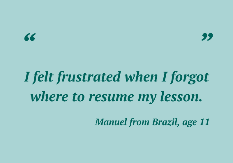
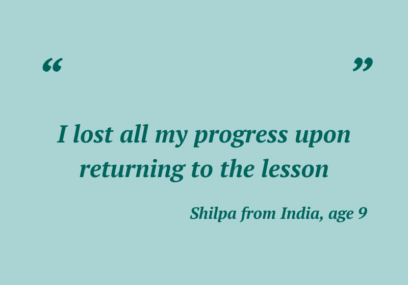
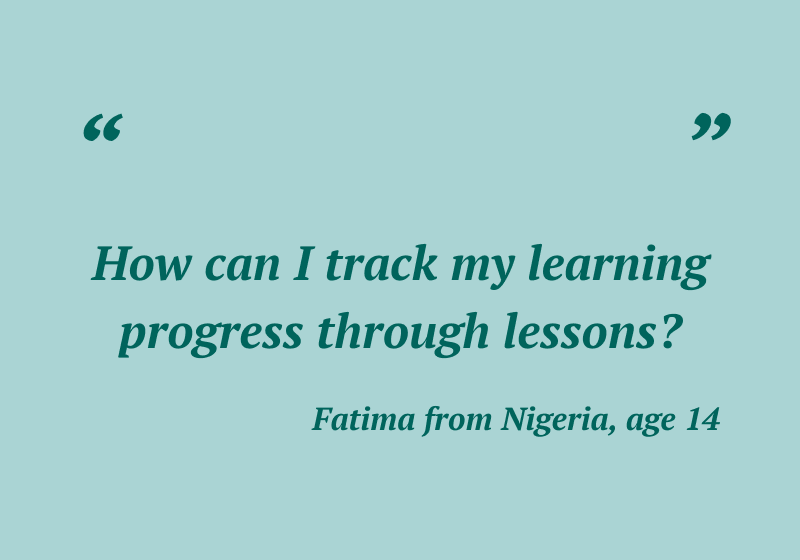
Users cannot track and save their learning progress during & after taking lessons.
What learners said → What we learned
Introduce the "Checkpoint" concept
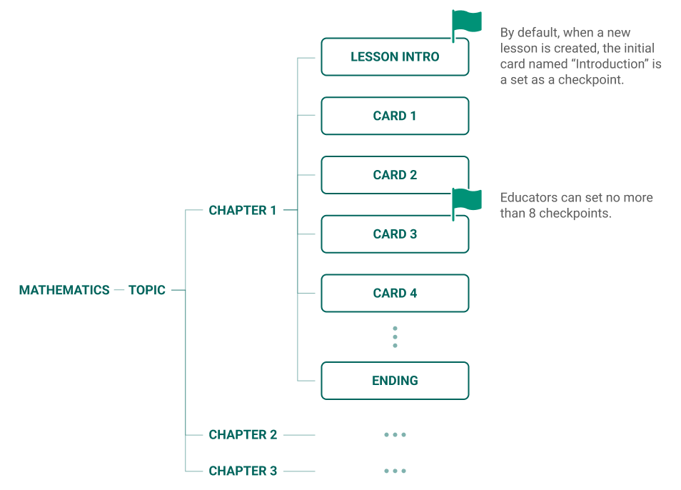
Checkpoints are mini-milestones inserted through lesson cards to allow users to track, save and retrieve their learning progress.
For Learners, they can use checkpoints to 1. track their learning progress; 2. save their learning progress for the next return.
For educators, they can set no more than 8 checkpoints to track students' learning progress and give directions.
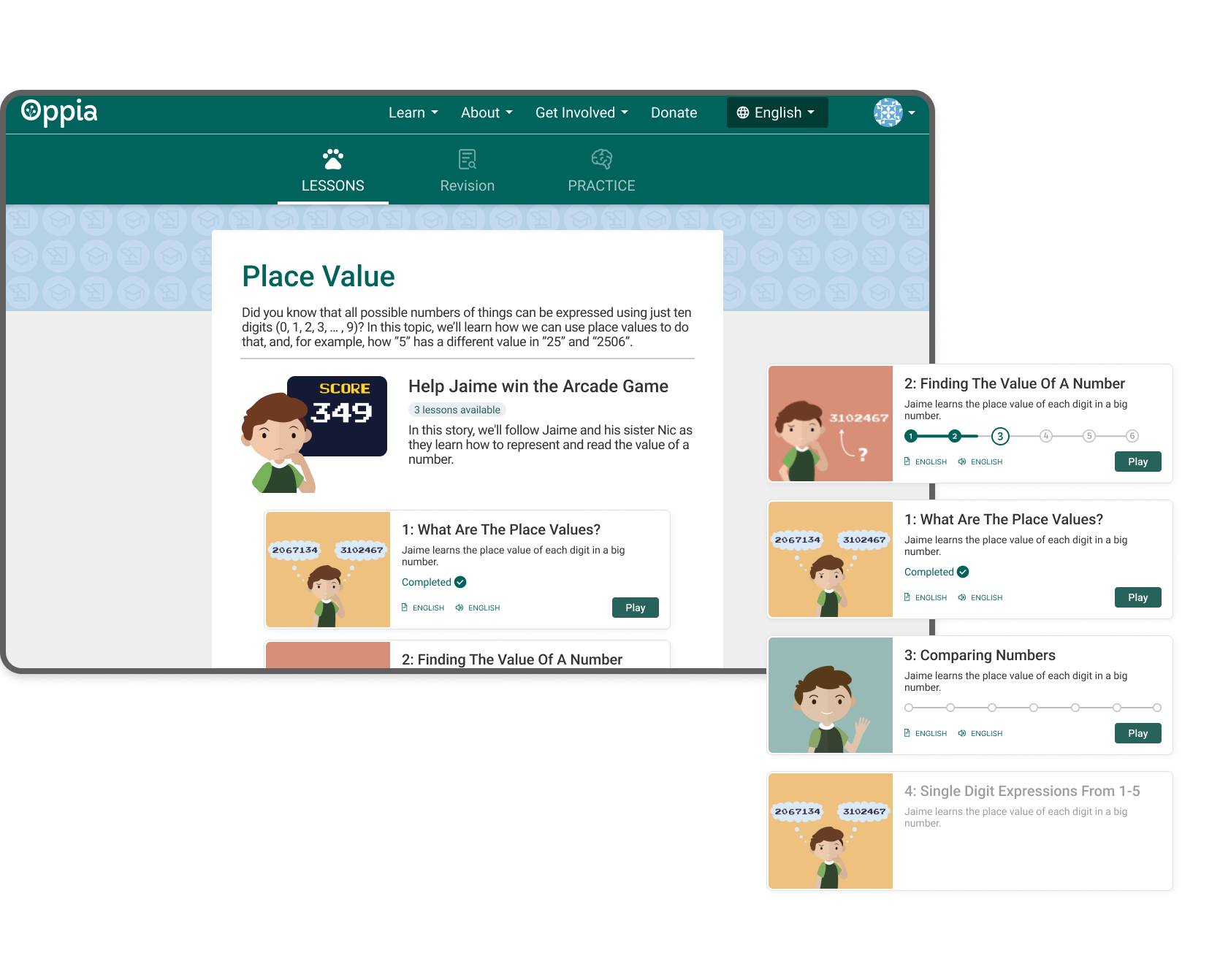
Users are able to choose lessons based on progress
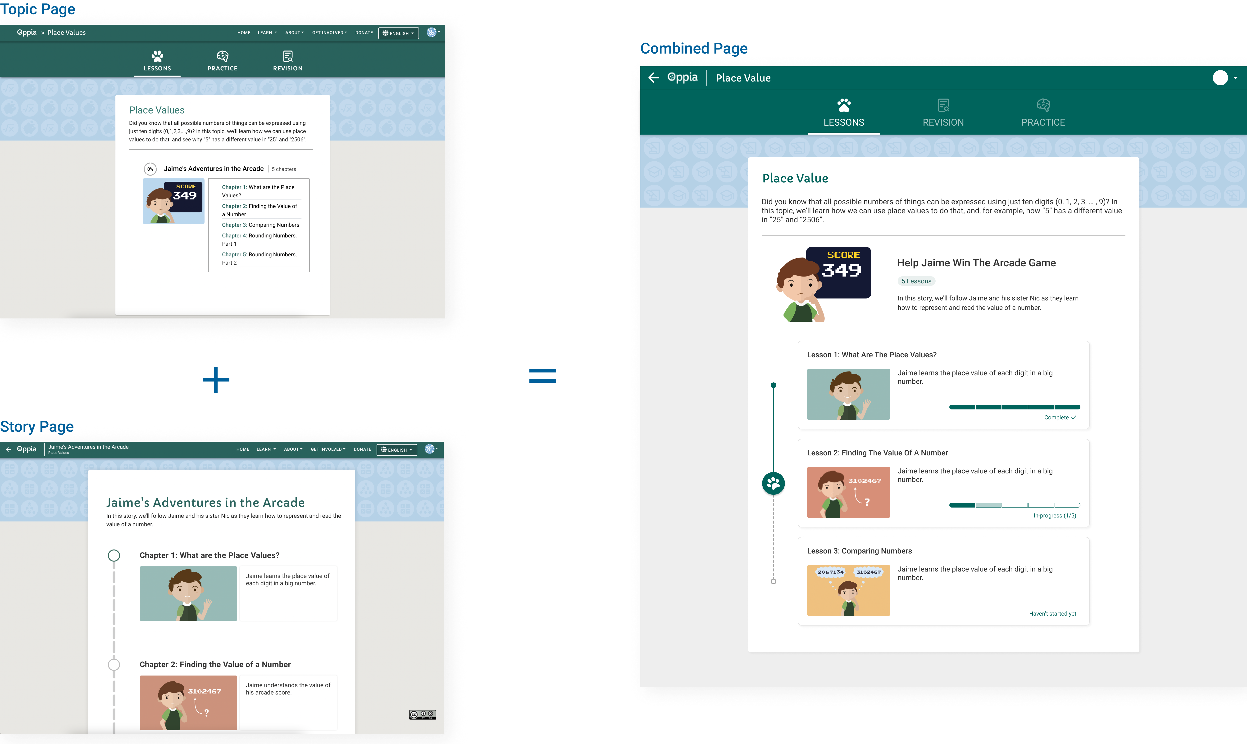
The topic and lesson pages are integrated to show progress indicators on each lesson card, helping learners decide their next step.
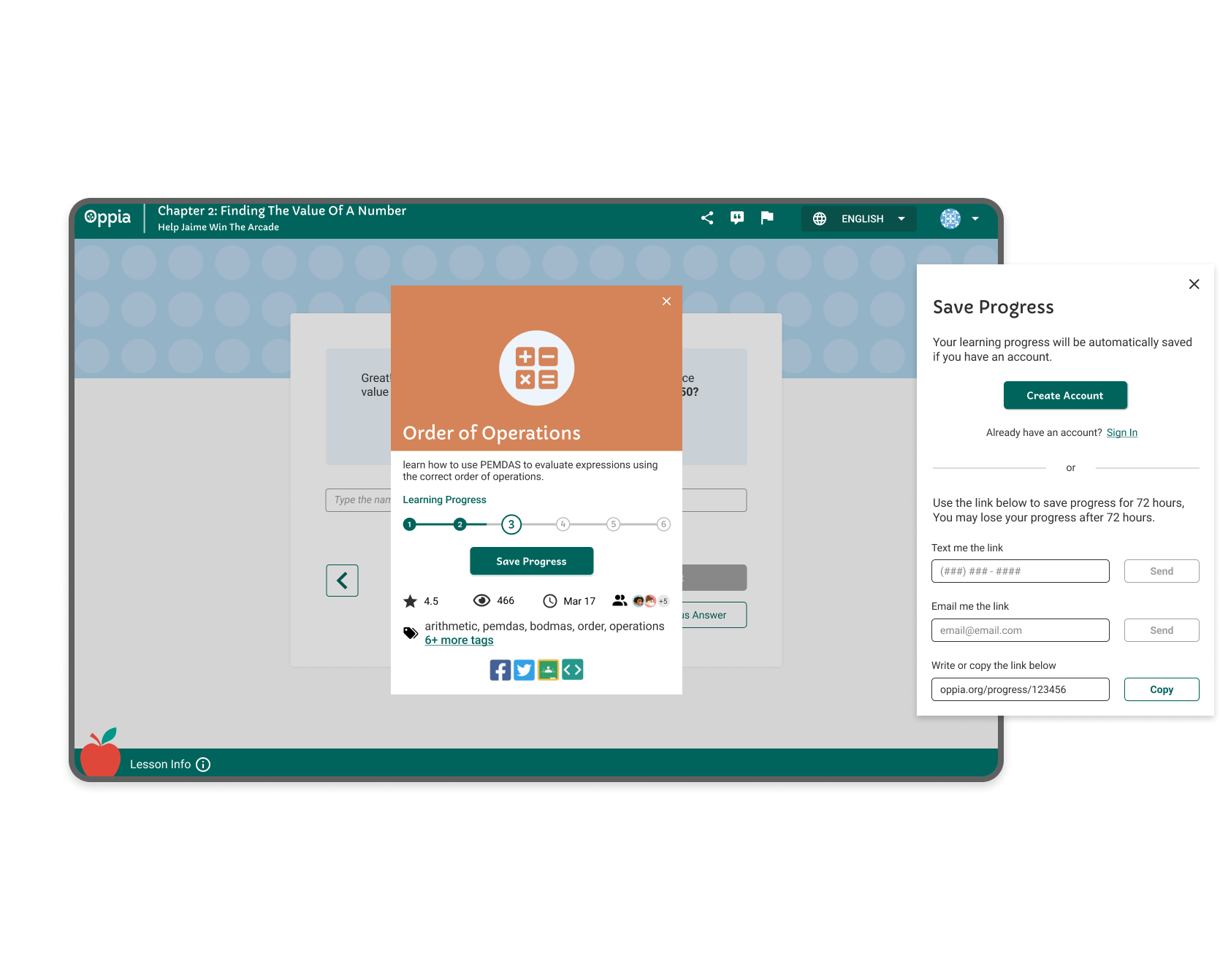
Users are able to track & save progress in lessons
Real-time learning progress is available in the lesson info modal, without adding pressure. Learners can save their progress whether they are registered or unregistered users.
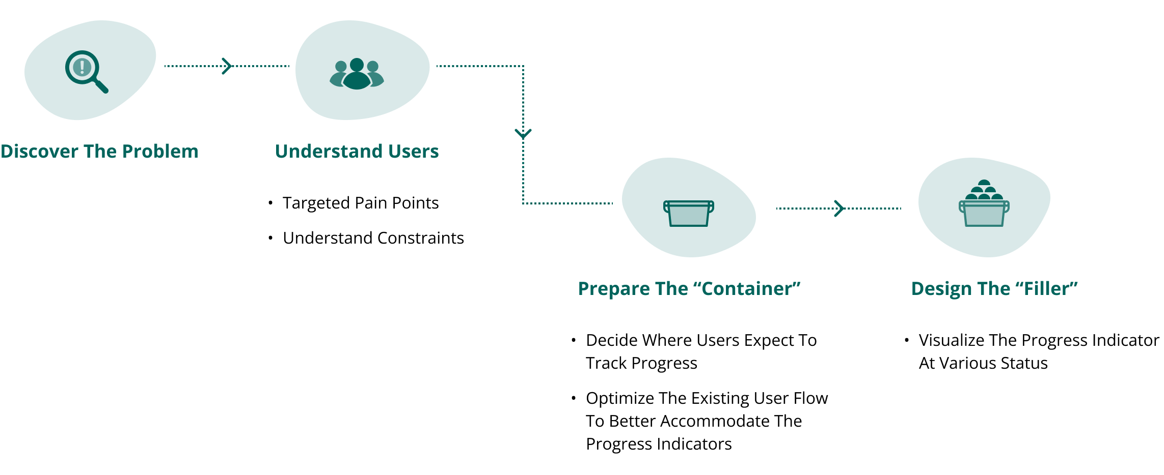
Design approach
From research to design
How did I get there?
Guided by user requests, I conducted interviews and spoke with researchers to identify pain points and expectations. During the design phase, I optimized the user flow for the new "Checkpoint" feature and designed it to visualize learning progress.
Research
Designing for young learners
Primary Users — Learners
Age: 7 - 14
Location: worldwide
- Knowing their progress can motivate students, but too much pressure can have negative effects.
- Learners have limited understanding of complicated diagrams and graphics;
- Learners may have very basic learning devices. Some of students are new to digital devices.
Where the current flow breaks down
There are two user cases that students and educators expect to check the learning progress:
User Case 1
Once logged in, they may want to check their progress overview to decide which lesson to continue or start.
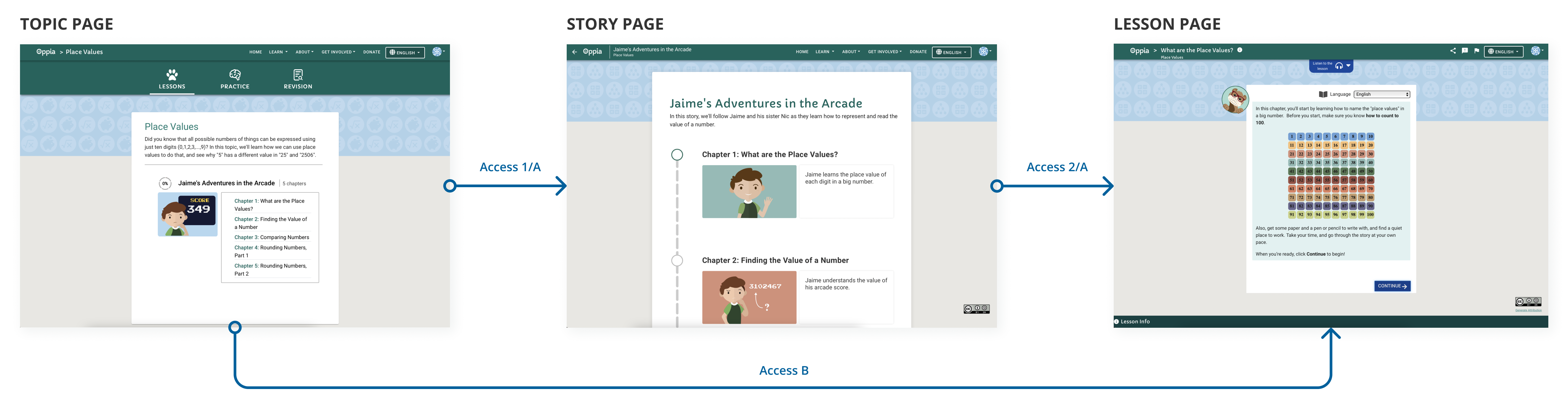
Repeating ways to access lessons confuse users.
As shown in the diagram above, users can get into the lesson page by either one click (Path B) or two clicks (Path A) from the upper-level topic page. Why do users need two clicks if one click can do the same thing?
Hierarchy is too complicated to understand.
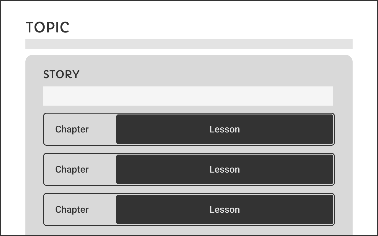
There are three levels of information for their math course:
Topic > Story > (Chapter = Lesson)
However, the formation architecture and wordings here are still too complicated for users to understand the hierarchy, which may cause misunderstanding when they start to track their learning progresses.
User Case 2
When taking the lessons, they may want to check their learning progresses to know where they are.
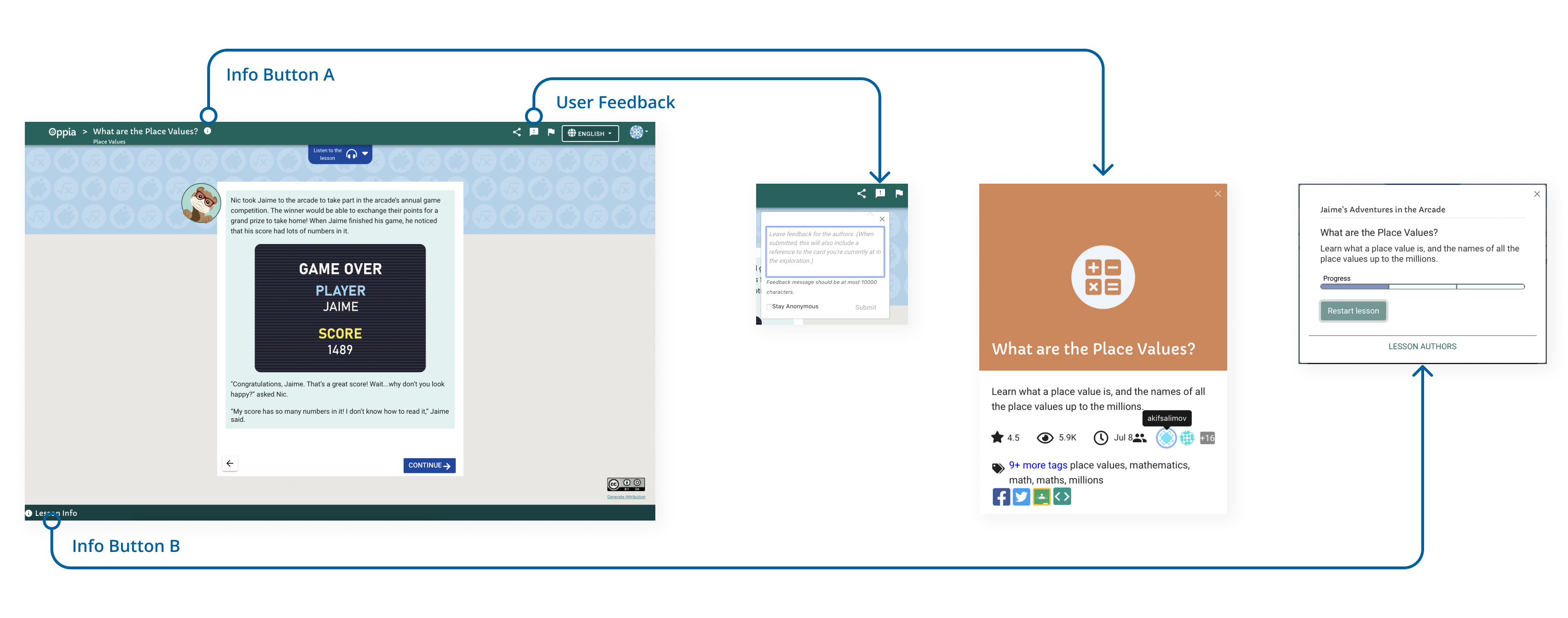
Too many "info" buttons misdirect users.
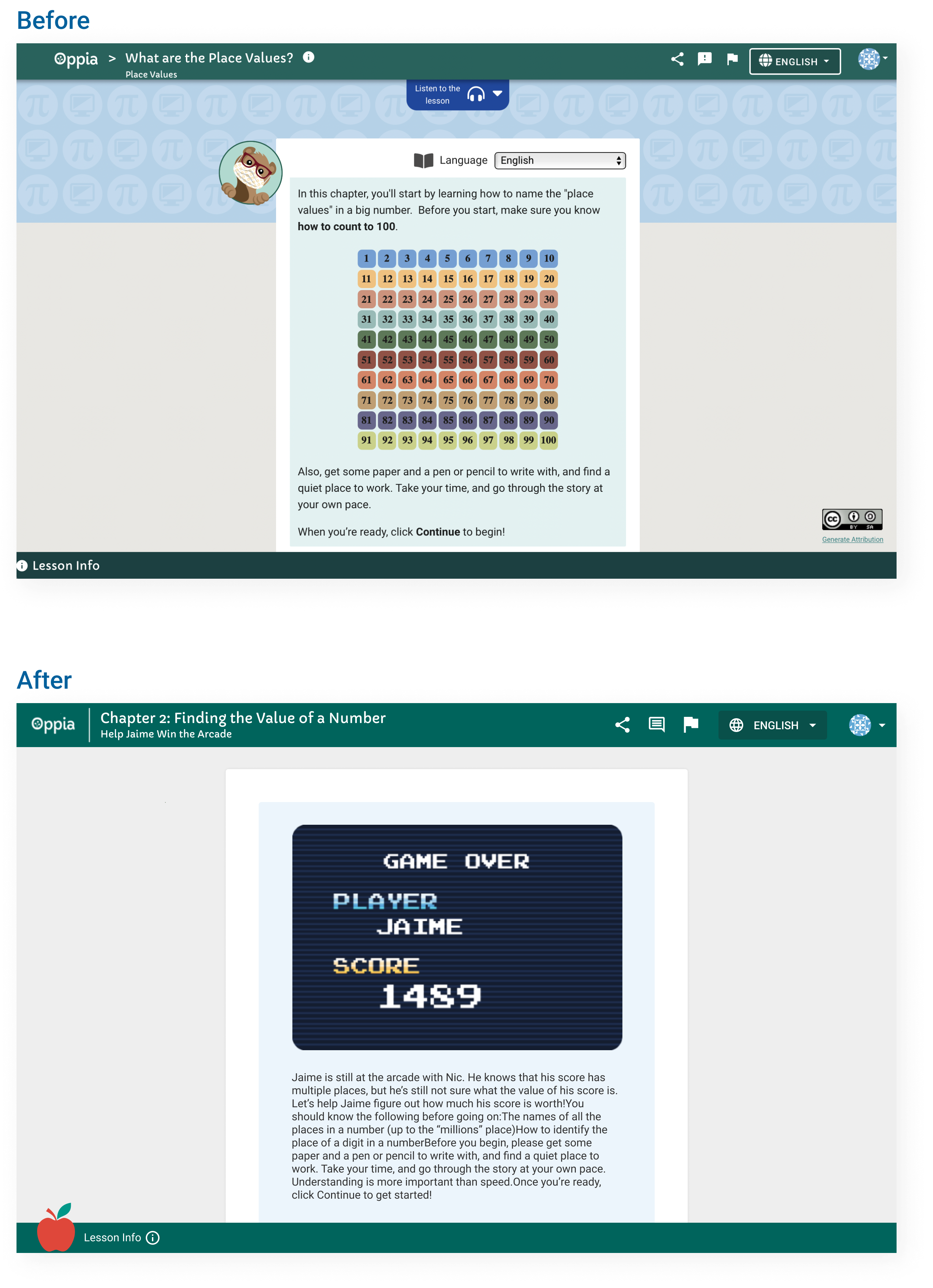
The lesson page has three exclamation icon buttons, each opening a different modal. Aside from the flagged feedback box, the two rounded info buttons both display basic lesson details. However, information like the brief intro, learning progress, and creator list are repeated in both. Can we consolidate this to make the page cleaner?
Design
Design goals
Optimize the current experience to seamlessly integrate the checkpoint features
After clarifying the "checkpoint" definition and knowing about the target user groups and current problems, I asked "How might we..." questions to guide the following solution ideation process.
- guide users to decide their next learning steps based on their progress?
- show users their learning progress clearly and without pressure?
- allow both registered and unregistered users to save their progress?
Optimizing lesson access
1. Rethink about the information hierarchy
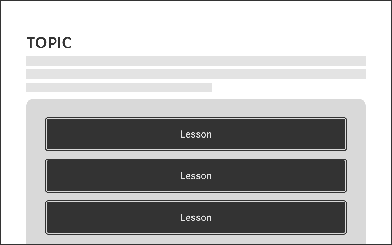
The simpler the information hierarchy, the easier learners can navigate to the targeted lessons.
Stories need to be considered as a way to teach the "topic" instead of another level of information. Since there is only one story in each topic, we decided only to use "topic" to represent this level of information.
2. Make the access easier, then show the learning progress
After simplifying the course structure, I reconsidered user case 1. If students can access lessons directly from the topic page or via the story page, why not combine them? Merging these pages also makes it easier to add a progress indicator, helping users choose which lesson to start.
3. Only show ONE info button with all necessary information
Before
Repeated information controls made the page harder to understand.
After
Related controls are combined so learners get one clear direction.
4. ONE lesson info modal
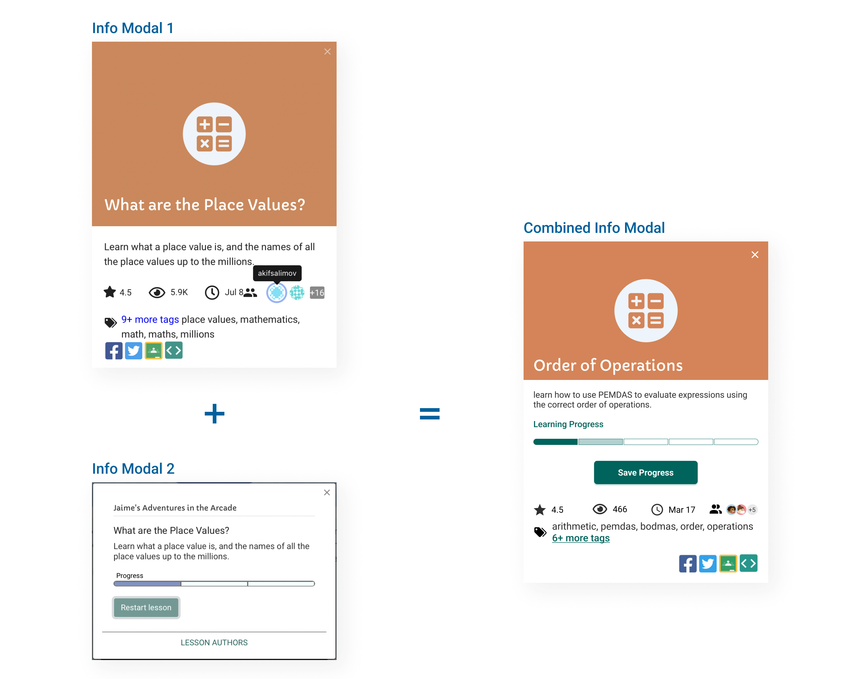
After discuss with the PM about other content in the info modal, we all agreeed that moving the progress bar to the Info Modal 1 makes more sense because it's the only distinctive information in the Info Modal 2.
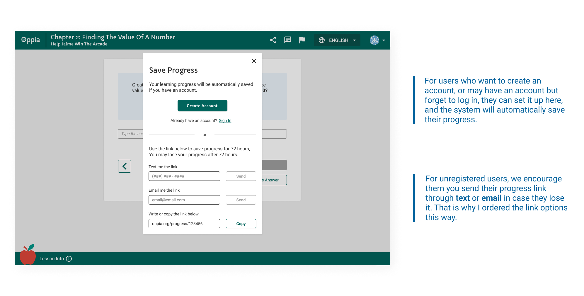
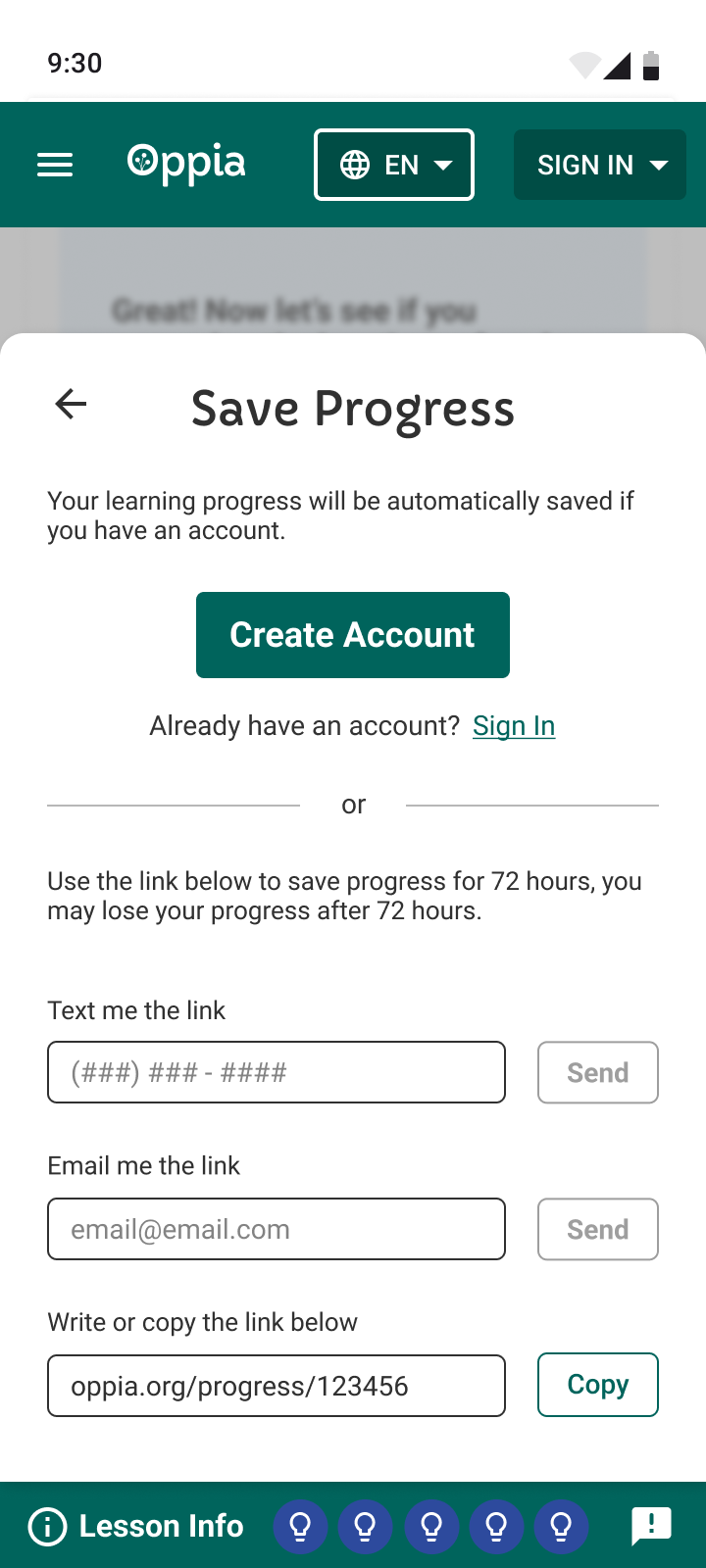
We also allowed unregistered users to save their progress via email or link, so they can resume lessons later without losing their place.
5. Save learning progress
The system will allow both registered and unregistered users to save their learning progresses.
Evidence
What usability testing revealed
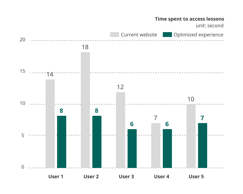
I coordinated with researchers to test the optimized experience of accessing lessons and saving learning progress with five users aged 8 to 13, compared to the current experience on the website. The results are as follows:
1.5 times faster to access lessons
The simplified information hierarchy and the optimized experience effectively reduce the time users spend on the lesson list page to access lessons.
4 out of 5 can find where to save their learning progress
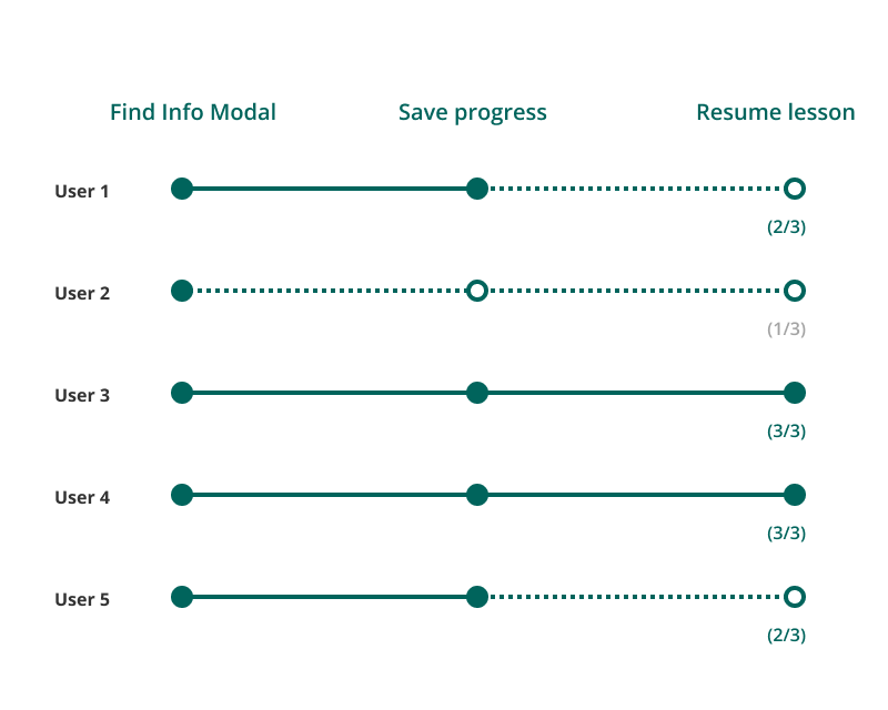
After integrating lesson information into one modal, all users could find their learning progress there, and 4 out of 5 successfully saved it before exiting.
However, only 2 out of 5 could resume their unfinished lessons, highlighting the need to improve progress visualization.
Progress visualization
The remaining challenge: resuming a lesson
After resolving the question - "where to show and save learning progress?", our team started to look back to the "checkpoints".
Now the question is - how to visualize the learning progress?
Making progress visible
I explored three versions of progress indicators to visualize users' learning progress. During the team design review, we all agreed that the final version excelled in both visualization and accessibility.
Progress indicator on the current website
- The blue color doesn’t match the general style of the current website.
- There is no gap between each segment, making it challenging to differentiate darker colors due to low contrast.
- Users may misunderstand the last three checkpoints as also in progress because of the light-blue fillings.
Progress indicator · Version I
- The hollow bars indicate users haven’t started those parts.
- The gaps between segments visually help users to read.
- Bars could be distinguishable by patterns, not only colors, concerning users who may have vision disabilities.
- It doesn’t visually interpret the meaning of “checkpoints”, which may mislead users.
Progress indicator · Version II
- Numbered circles visualize “checkpoints”. Users can see where they are in a lesson and how far they are from the next checkpoint.
- Various sizes, colors, and patterns distinguish the learning status of checkpoints.
Design the lesson card
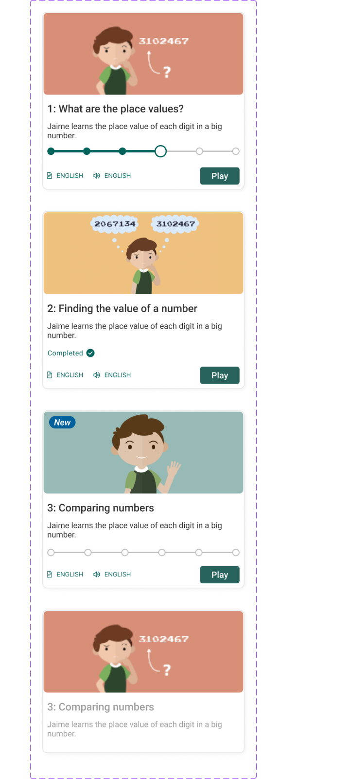
I refined the lesson card to make progress easier to read while keeping lesson information clear and organized.
Lesson card on the current website
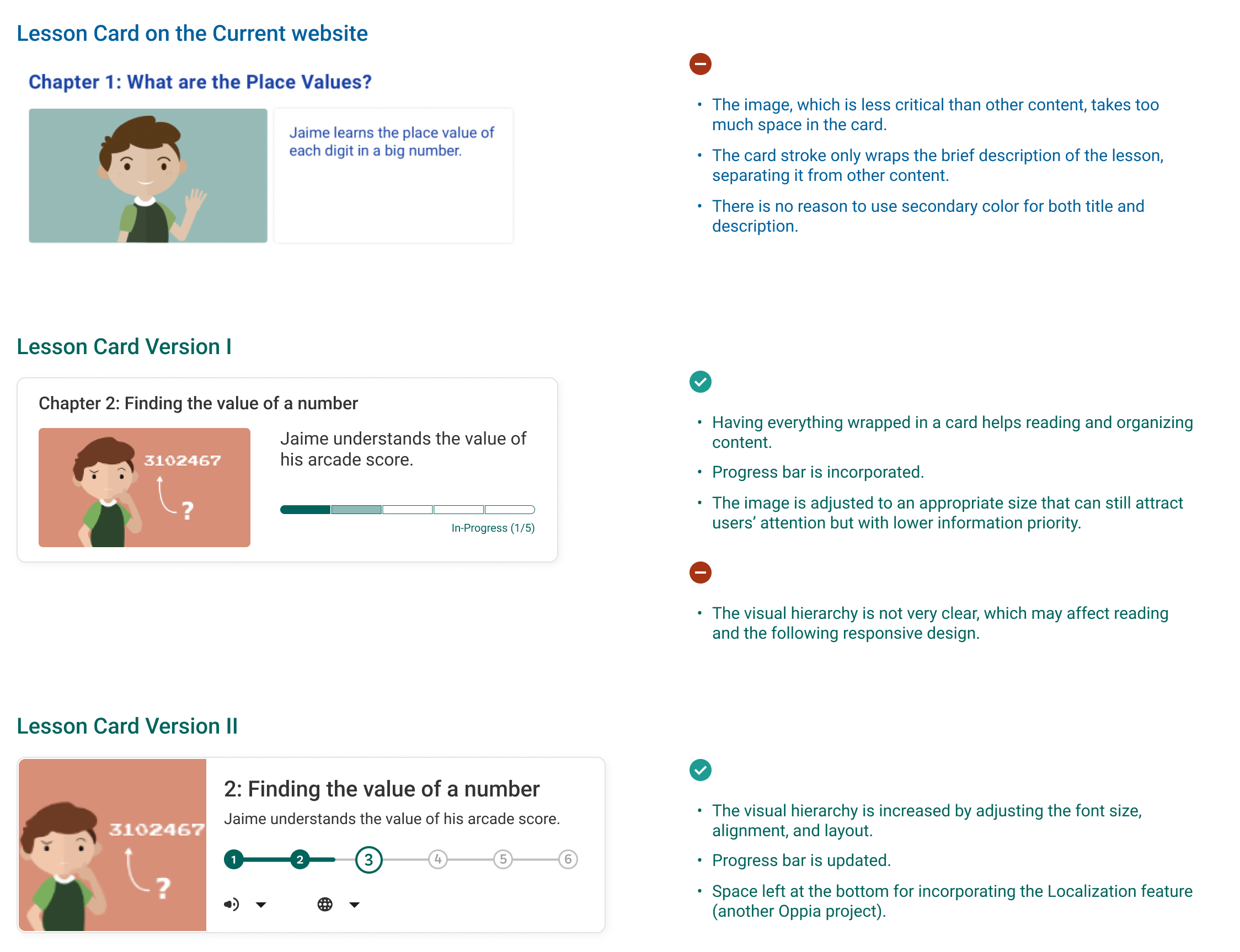
- The image, which is less critical than other content, takes too much space in the card.
- The card stroke only wraps the brief description of the lesson, separating it from other content.
- There is no reason to use secondary color for both title and description.
Lesson card · Version I
- Having everything wrapped in a card helps reading and organizing content.
- Progress bar is incorporated.
- The image is adjusted to an appropriate size that attracts attention with lower information priority.
- The visual hierarchy is not very clear, which may affect reading and the responsive design.
Lesson card · Version II
- The visual hierarchy is increased by adjusting the font size, alignment, and layout.
- Progress bar is updated.
- Space is left at the bottom for incorporating the localization feature (another Oppia project).
Final experience
Resume the Lesson
For registered users or those returning with a progress link, the system shows where they last left off. They can resume from the last checkpoint or restart the lesson.
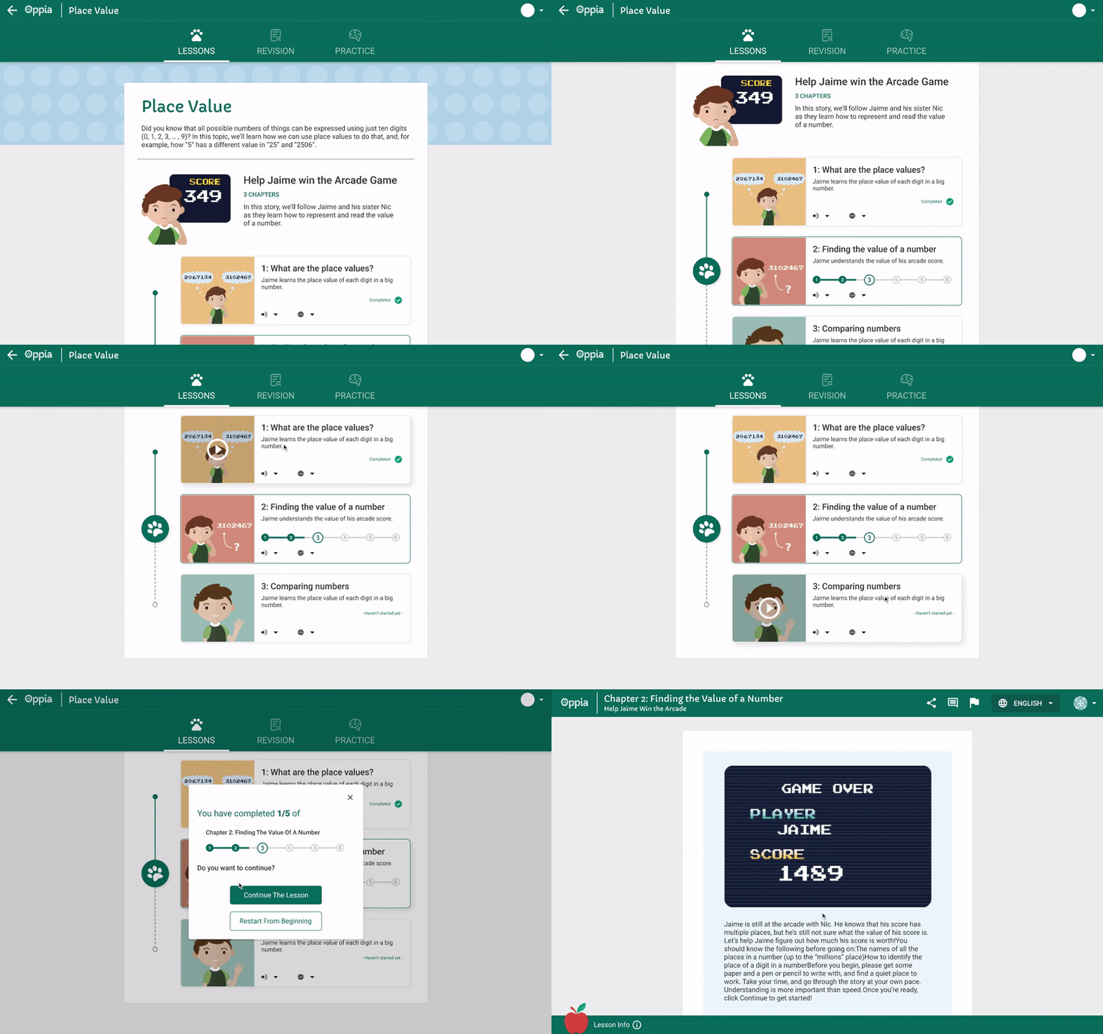
For Registered Users
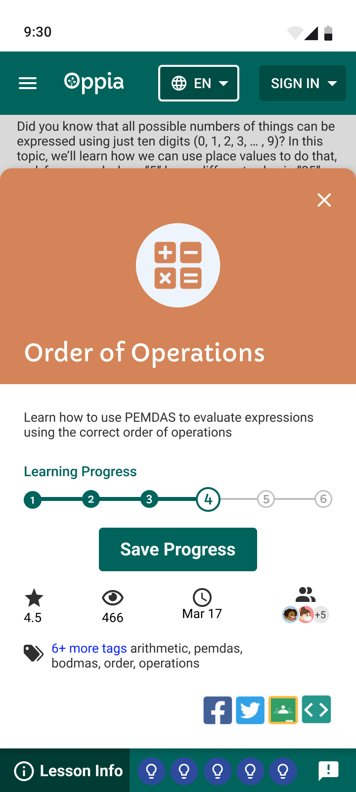
Registered users can view their progress via the lesson info button in the bottom bar. The system automatically saves their progress, so manual saving isn't needed after logging in.
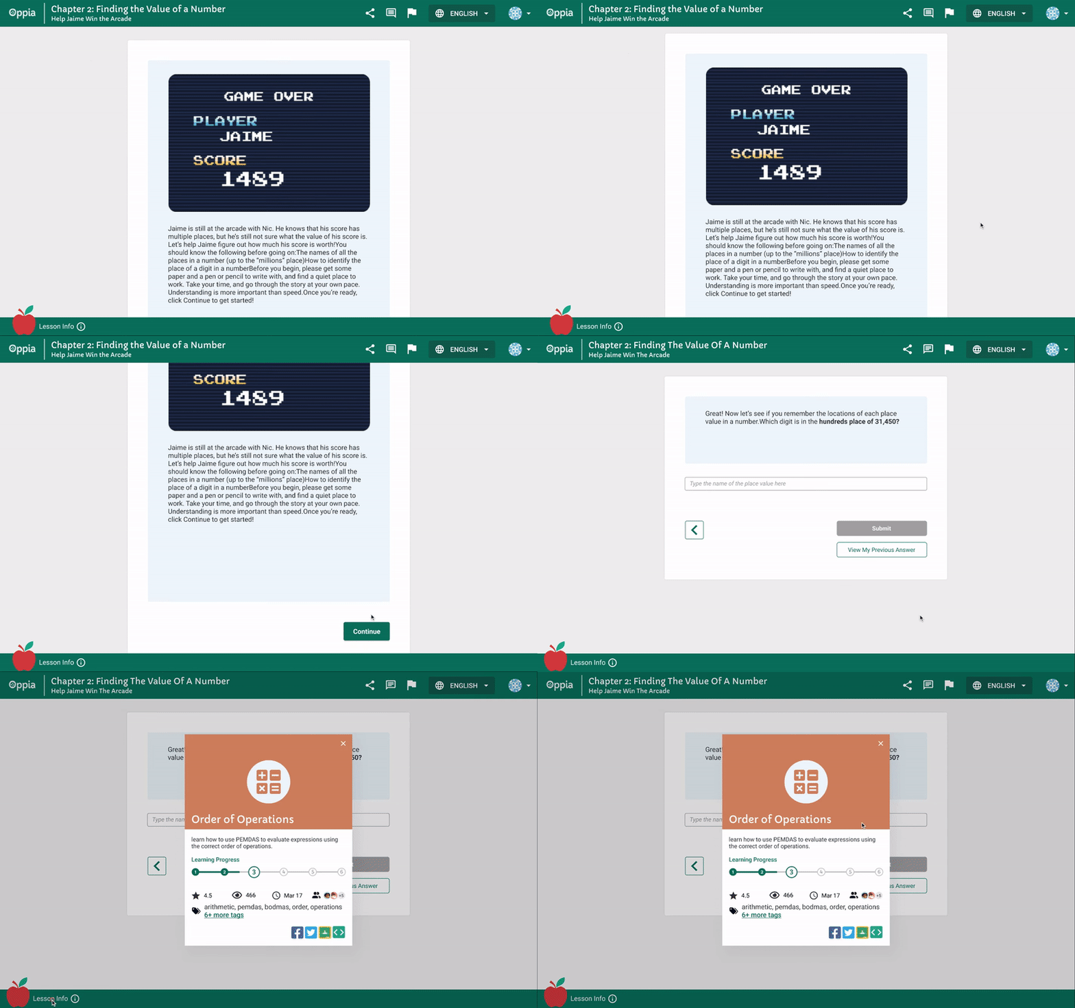
For Unregistered Users
In the same info modal, unregistered users can save their progress by clicking the button below the progress bar and use the saved link to resume from the last checkpoint within 72 hours.
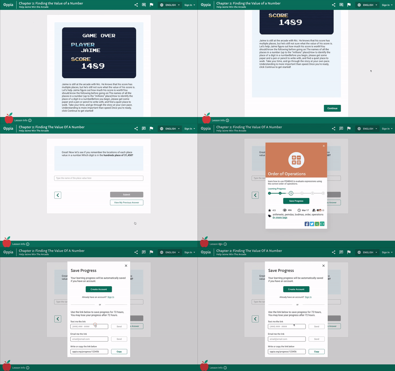
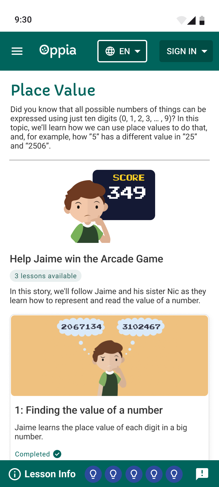
Adapting the experience to mobile
I started the responsive design for the Android devices after having the desktop version handed off to engineers to implement. The design is mainly referred to the Material Design Guideline created by Google.
Reflection
What I learned
Flexible design for all the possible situations
One flow must support different users, devices, and return states. Designing for those variations early made the checkpoint experience more resilient.
Visualization is the visual way of interpretation.
Familiar UI patterns can distort a new concept. Asking why an element exists—and how learners interpret it—led to clearer progress indicators.
What needs further validation
Verify the design by research
Several decisions began as team assumptions informed by existing interviews. Future testing should validate them with launch data and direct learner feedback.
Coordination on the Oppia design guideline
The new checkpoint patterns should be added to Oppia’s shared design guidelines so future teams can apply them consistently.